Prioritize your inventory with ABC analysis in Zoho Analytics
- Last Updated : September 16, 2026
- 113 Views
- 9 Min Read

Picture a purchasing team managing a catalog of hundreds of SKUs (Stock Keeping Units). They cannot closely monitor every product, so every product gets the same treatment: the same reorder rules, the same counting effort, the same worry. But the products are not equal. In the sample dataset we use in this solution, a single travel router generates more revenue than the bottom 28 products combined.
This is the Pareto principle at work, and it holds in almost every inventory: a small slice of your catalog produces most of your revenue, while a long tail of items quietly consumes storage space, counting hours, and working capital.
ABC analysis is the classification method that makes this imbalance visible and actionable. It ranks your products by revenue contribution and sorts them into three classes, so inventory effort can focus where it matters most.
In this solution, you'll learn how ABC analysis works, how to compute it in Zoho Analytics with a single query table, and how to build a Pareto dashboard that shows exactly where your inventory value is concentrated.
What you'll build
By the end of this solution, you will have:
- An automated ABC classification that recomputes as new transactions sync
- A Pareto chart with visible class cutoff lines
- A class summary chart showing products versus revenue share per class
- An interactive inventory dashboard that brings all three together
What is ABC analysis?
ABC analysis ranks every item by the revenue it generates, then divides the ranked list into three classes:
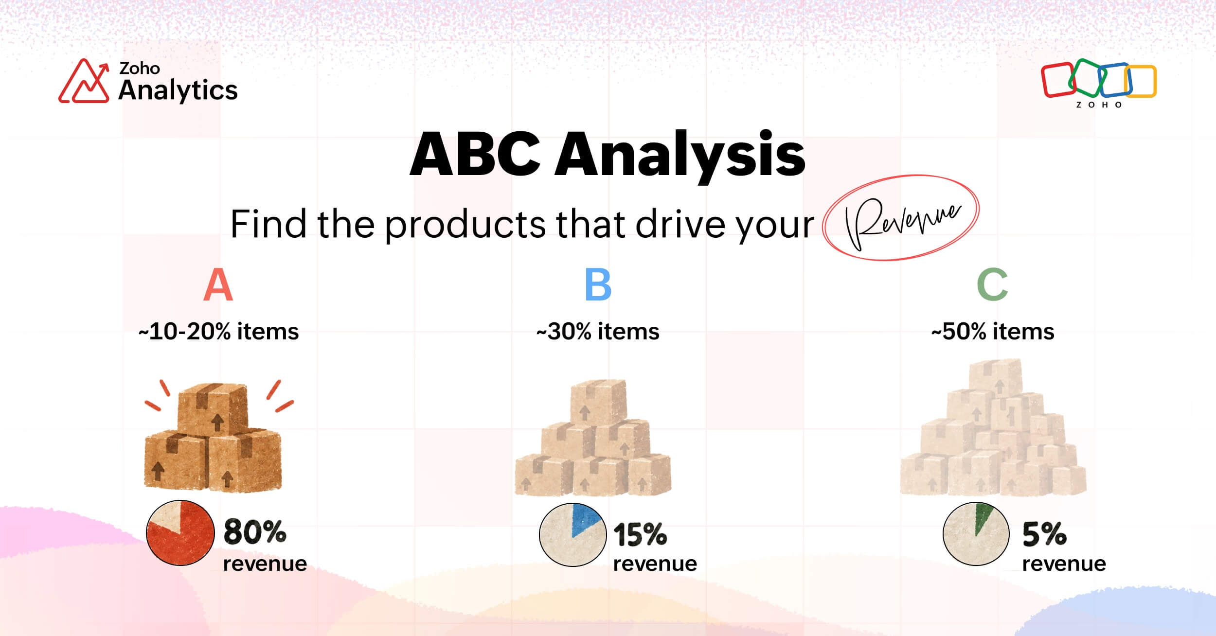
- A items are the vital few. They typically make up 10 to 20 percent of your products but contribute about 80 percent of revenue. These deserve tight control: safety stock, frequent cycle counts, and close supplier relationships. A stockout here directly costs revenue.
- B items are the middle. Around 30 percent of products contribute roughly 15 percent of revenue. Standard reorder automation and periodic reviews are enough.
- C items are the trivial many. Often half your catalog or more, contributing as little as 5 percent of revenue. Order them in bulk, count them rarely, and periodically ask whether you should sell them at all.
The classic thresholds place the A cutoff at 80 percent of cumulative revenue and the B cutoff at 95 percent. These are conventions, not laws. You can tune them to your business, and the build below makes the cutoffs easy to change.
The trap ABC analysis exposes is that most businesses spend the same effort per SKU. Since C items outnumber everything else, most of the effort goes to the products that matter least.
How the classification is computed
How it works: four steps
- Total - compute revenue per product over a period
- Rank - sort products from highest revenue to lowest
- Accumulate - compute the running percentage of revenue share down the ranked list
- Classify - apply the cutoffs: up to 80 percent cumulative is class A, 80 to 95 percent is class B, and the rest is class C
That is the entire method. In the sample dataset we are about to build with, these four steps will reveal that just 12 of 60 products carry nearly 80 percent of the revenue.
Now that you have seen how the classification works conceptually, let's build it in Zoho Analytics using a sample sales dataset.
The sample dataset
Zylker sample sales data
- Company: Zylker, a fictional consumer electronics brand
- Products: 60 SKUs across 8 categories
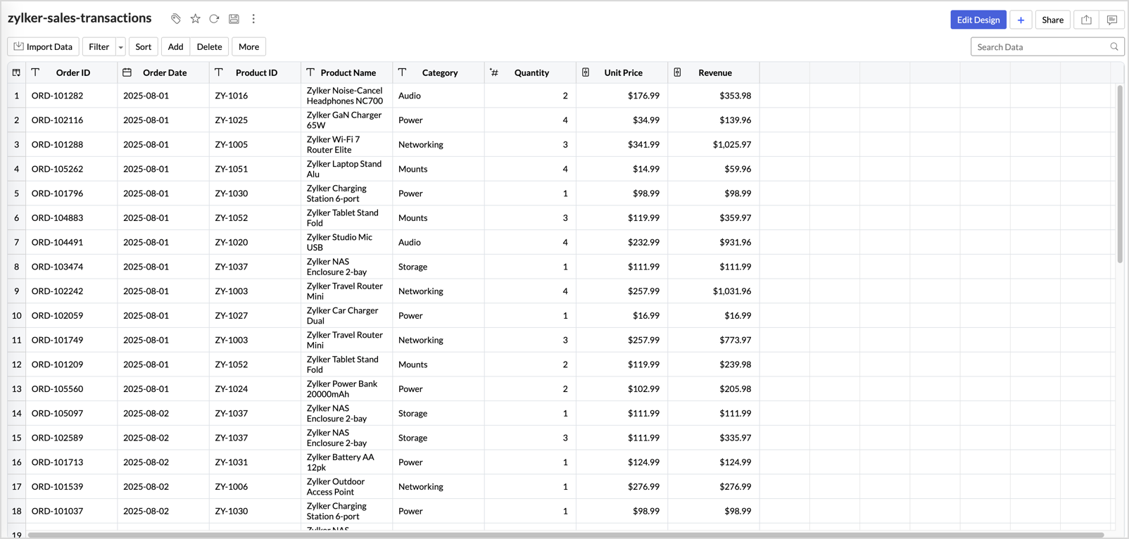
- Transactions: 6,000 order lines spanning twelve months
- Total revenue: 2,029,918 USD
- Columns: Order ID, Order Date, Product ID, Product Name, Category, Quantity, Unit Price, Revenue
Download the dataset to follow along: Sample Dataset
The steps work identically with your own transaction data. Zoho Analytics connects to 500+ data sources, so your orders can come from your commerce platform, your database, or a spreadsheet. If you use Zoho Inventory, note that its advanced analytics integration ships with a prebuilt ABC report, which may be all you need. This solution shows how to build the classification from any transaction data, with full control over the logic.
Step 1: Import your transaction data
Create a new workspace in Zoho Analytics and import your transaction data. You can upload a file, or import directly from your business apps and databases using the available connectors. In this build, we import the sample CSV.
Once the import completes, open the table and confirm the row count at the bottom right matches your source file, 6,000 rows in our case. Check that Order Date was detected as a date column and that Quantity, Unit Price, and Revenue are numeric.
Refer here on how to import your data in detail.
Step 2: Compute the classification with a query table
A query table lets you transform your data using standard SQL SELECT queries.
To create one, click the Create (+) icon and choose Query Table under Transform Data. If you prefer assisted query building, the editor includes the Zia Query Generator, but the SQL for this solution is short enough to write directly.
Zoho Analytics query tables support SQL window functions (functions that let each row use values from other rows in the result, which is how a running total is computed). This means the entire computation fits in one query: the aggregation, the cumulative math, and the classification. No intermediate tables and no self-joins are needed. Paste the following query, adjusting the table name to match yours:
SELECT
  "Product ID",
  "Product Name",
  "Category",
  ROUND(SUM("Revenue"), 2) AS "Total Revenue",
  ROUND(SUM(SUM("Revenue")) OVER (ORDER BY SUM("Revenue") DESC), 2) AS "Cumulative Rev",
  ROUND(SUM(SUM("Revenue")) OVER (ORDER BY SUM("Revenue") DESC) * 100.0
        / SUM(SUM("Revenue")) OVER (), 2) AS "Cumulative Pct",
  CASE
    WHEN SUM(SUM("Revenue")) OVER (ORDER BY SUM("Revenue") DESC) * 100.0
         / SUM(SUM("Revenue")) OVER () <= 80 THEN 'A'
    WHEN SUM(SUM("Revenue")) OVER (ORDER BY SUM("Revenue") DESC) * 100.0
         / SUM(SUM("Revenue")) OVER () <= 95 THEN 'B'
    ELSE 'C'
  END AS "Class"
FROM "zylker-sales-transactions"
GROUP BY "Product ID", "Product Name", "Category"
ORDER BY "Total Revenue" DESC
The query works in three layers:
The GROUP BY and SUM("Revenue") aggregate the individual order lines into one revenue total per product.
The window function SUM(SUM("Revenue")) OVER (ORDER BY SUM("Revenue") DESC) then produces a running total down the ranked list, and dividing it by the grand total gives the cumulative percentage.
Finally, the CASE expression assigns the class based on that percentage.
Two things to note as you work with this query:
- You may notice the same cumulative formula appears more than once: as the Cumulative Pct column and again inside the CASE. This repetition is required. In SQL, all columns of a SELECT are computed together, so one column cannot refer to another by its new name (its alias) within the same query. If you shorten the CASE to use Cumulative Pct instead of the full formula, the query returns an error.
- The results preview shows only the top 10 rows. Save the query table and switch to View Mode to see all rows.
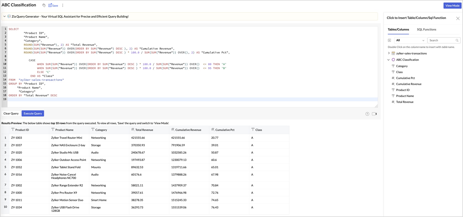
Name the query table as ABC Classification, save it, and open in View Mode.
The ranked list now tells the story: the top product, the Travel Router Mini, contributes 20.77 percent of total revenue on its own. By the twelfth product, the running total reaches 79.86 percent, and right there the Class column flips from A to B. Twenty products later it flips again to C.
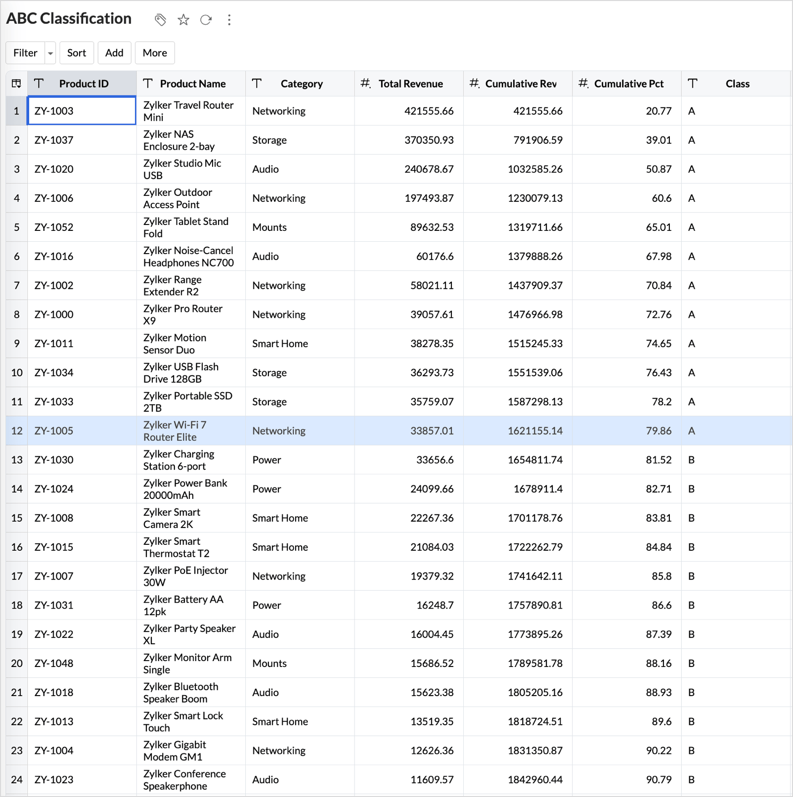
To change the cutoffs later, edit the two numbers in the CASE expression. The classification recomputes automatically, and it also stays current as new transactions sync into the source table.
Step 3: Build the Pareto chart
The Pareto chart is the classic ABC visual: revenue bars in descending order with the cumulative percentage climbing across them.
Create a Chart View on the ABC Classification table. Drop Product Name on the X-axis, then add Total Revenue and Cumulative Pct to the Y-axis, both as Sum. Pick the Bar with Line combination chart from the chart type gallery.
By default, the chart may assign the wrong series to the line. To control this, open Settings (the gear icon), go to General, and expand Combination. Set Total Revenue to Bar and Cumulative Pct to Line.
Next, sort the bars from highest revenue to lowest so they form the Pareto staircase. Click Sort and choose By Y-Value - Descending. Because this chart has two Y-axis columns, a submenu opens asking which column to sort by. Select Total Revenue.
The default legend labels include the aggregation prefix and can read awkwardly, such as Total Total Revenue. To rename them, open Settings, expand the Legend section, and enter the display names you want. In this build, we used Revenue and Cumulative%.
Now make the classification visible on the chart itself. Under Settings, expand Threshold and add two lines: one at the constant value 80 named A/B cutoff, and one at 95 named B/C cutoff. Two tips from building this:
- The Reference Axis of a threshold defaults to the first Y-axis series, which is Total Revenue. For percentage cutoffs, switch the Reference Axis to Sum(Cumulative Pct).
- Clicking + Add Threshold creates a new row in the dialog. Fill in the new row rather than editing the existing one, or you will overwrite your first threshold.
Give the two lines different colors so they read as two distinct cutoffs. Name the chart Pareto Analysis - Revenue by Product and save.
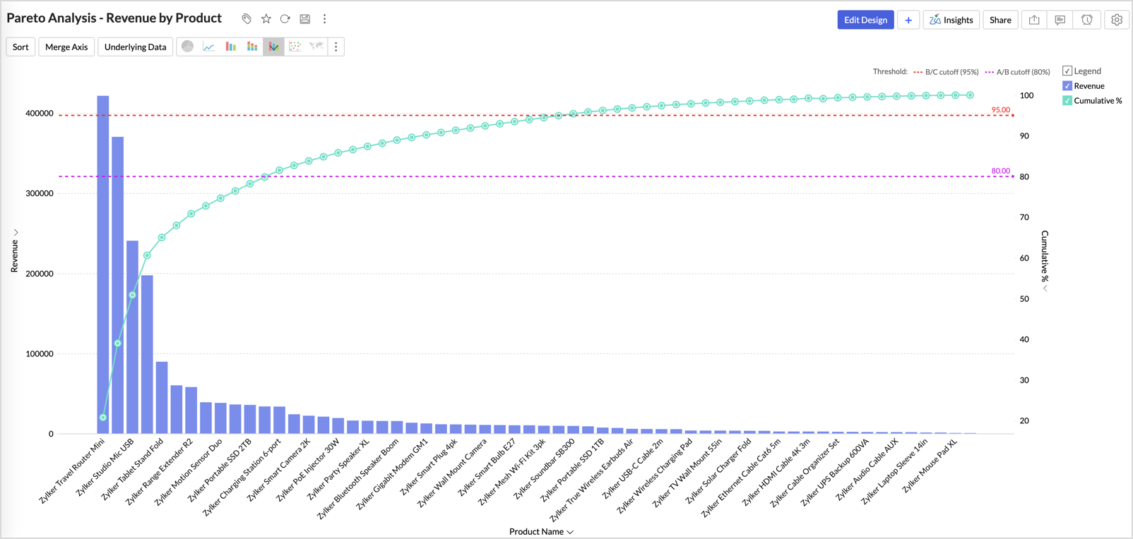
The chart now makes it easy to identify where the A, B, and C classes begin. The cumulative curve crosses the 80 line at the twelfth product and the 95 line at the thirty-second, and those crossing points are the classification.
Everything left of the first crossing is class A. The long flat tail of tiny bars to the right is class C, a clear visualization of how little the trivial many contribute.
Step 4: Build the class summary chart
One more chart makes the imbalance unmistakable. Create a Chart View on the same table with Class on the X-axis.
Add Product ID to the Y-axis and set its aggregation to Count, which gives the number of products per class. Add Total Revenue as the second series, and in its aggregation menu choose Show Data As and then % of Total, which converts raw revenue into revenue share.
Turn on data labels so the values print on the bars: open Settings, and under the axis settings enable the Data Label option. Rename the legend entries to SKU count and Revenue (%).
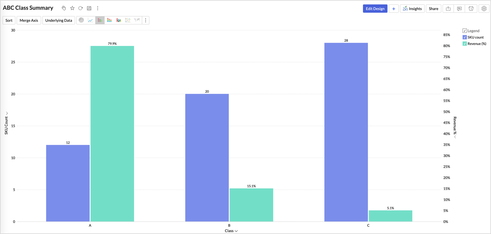
The chart clearly summarizes the classification in three pairs of bars.
- Class A: 12 products, 79.9 percent of revenue.
- Class B: 20 products, 15.1 percent.
- Class C: 28 products, 5.1 percent.
The smallest group of products holds the most money, and the largest group holds the least.
Name the chart ABC Class Summary and save.
Step 5: Assemble the dashboard
Create a new Dashboard and drag in the three views: the Pareto chart at full width on top, and the class summary and the ABC Classification table side by side below it. Query tables drop straight onto dashboards, so the classified product list needs no extra report.
Every view on the dashboard is interactive. Click any bar to view the underlying records, ask Zia Insights to explain the data, or drill down. When someone asks which products are in class C, the answer is one click away.
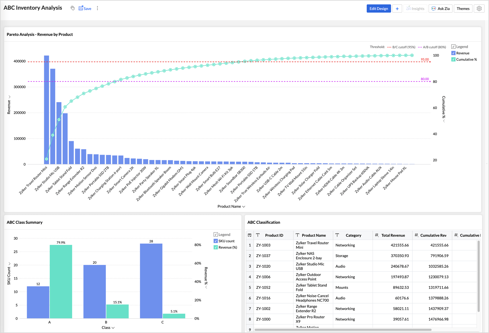
Name the dashboard ABC Inventory Analysis, and share it with your operations team.
What to do with your classes
The classification pays off when it changes how you operate:
- Reorder policy: Set tight reorder points with safety stock for A items, standard automated reorder rules for B, and bulk infrequent orders for C.
- Cycle counting: Count A items frequently, B items quarterly, and C items once or twice a year.
- Supplier management: Invest negotiation time and relationship building where the revenue is, in your A item suppliers.
- Catalog reviews: Put the C items on a periodic discontinue review. Some of them earn their place as complements to A items, and the rest are candidates to cut.
Keep in mind
Revenue is one lens, not the only one. A cheap item can be class C by revenue but operationally critical, like the two-dollar gasket without which a five-thousand-dollar machine cannot ship. Treat the classification as a starting point for judgment, not a replacement for it.
ABC analysis is also a snapshot. Seasonal items drift between classes over the year, so revisit the results periodically. Because the classification lives in a query table, it recomputes automatically as new transactions sync, and the dashboard always reflects the current state.
Finally, the 80/15/5 split is the classic convention. If your business concentrates differently, adjust the two cutoff values in the query and move the threshold lines to match.
Get started
Query tables are available on every Zoho Analytics plan, and this entire solution uses just one. Import your transaction data, paste the query, and you can see your own inventory's Pareto curve within the hour.
To explore how Zoho Analytics can work for your business, start your 15-day free trial or book a personalized demo.
15-day free trial. No credit card required.