- HOME
- BI & Analytics
- Data Storytelling Tools with Compelling Visualizations
Data Storytelling Tools with Compelling Visualizations
- Last Updated : June 19, 2026
- 1.2K Views
- 12 Min Read
Data storytelling tools help translate complex analysis into something everyone can understand and relate to. Maybe you’ve spent hours creating detailed reports only to watch your audience’s eyes glaze over within minutes. Your data visualization dashboards display all the right numbers and charts, but they fail to capture attention or drive action. Don't worry; you’re not alone.
The problem isn’t just about making things look pretty. Without a compelling narrative, your insights get lost, and decision-makers can’t connect the dots. Your brilliant analysis ends up as just another forgotten presentation gathering digital dust.
However, the good news is that modern data visualization software and storytelling solutions are changing how we present data effectively. These tools combine the three essential elements, narrative, visuals, and data, to transform raw numbers into meaningful stories that actually inspire action.
When stories become your default way to share insights, data gets democratized across your organization.
That’s exactly why we’ve put together this list of the four best data storytelling tools in 2026 that will make your reports stand out and get noticed.
What is a data storytelling tool?
A data storytelling tool is software that puts visualization, narrative context, and reporting into a single package. Instead of handing someone a table of numbers or a static chart, you hand them something that explains what happened, why it matters, and what to do about it.
The difference from a standard BI tool is the narrative layer. That means automated summaries written in plain language, presentation modes that walk an audience through findings step by step, and AI-generated explanations that translate what a chart is showing into something anyone can read.
This matters because a chart alone rarely settles the question. A sales dip in Q3 could be seasonality, a lost contract, a pricing change, or something else entirely. Without any context built into the report, the person reading it fills in the blank themselves, and often gets it wrong. A data storytelling tool builds that context in.
Why you should be using a data storytelling tool?
Reports and data visualizations get ignored because the format makes it hard to act on. Someone skims the dashboard, misses the key number, and walks out of the meeting without a clear next step. The work was good, but the presentation did not carry it.
93% of data professionals agree that decisions driven by data storytelling can increase revenue, according to a study of 500 leaders and data professionals at large US enterprises by Exasol. And yet, 49% of those same respondents say their organization lacks the skills to present data in a way that actually lands, regardless of how data-literate the team is.
Exasol's study aslo states that 87% of data professionals also agree that clearer presentation leads directly to more data-based decisions by leadership. So the bottleneck usually is the quality of the handoff.
Data storytelling tools handle more of that handoff automatically, pulling written narrative out of your charts, keeping slides in sync with live data, and letting someone who isn't a data analyst ask questions directly without filing a request and waiting.
Best data storytelling tools: Detailed comparison
Let's see the list of top four best data storytelling tools based on features, ease of use, and pricing.
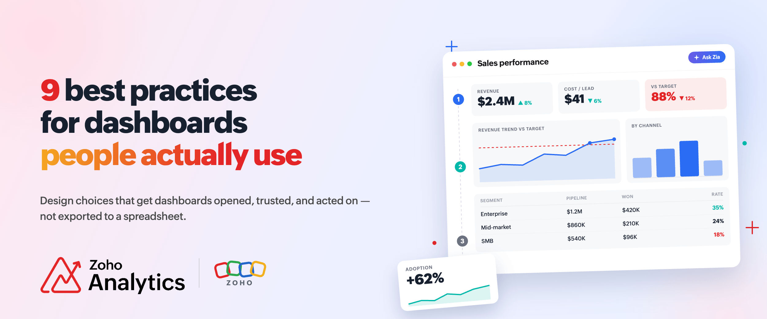
1. Zoho Analytics
Businesses generate mountains of data but often struggle to make it understandable and actionable. Do you find yourself creating detailed reports that your team or clients misinterpret or ignore? The disconnect between data collection and meaningful analysis causes many organizations to miss critical business opportunities and make uninformed decisions.
Zoho Analytics solves this challenge by transforming raw business data into compelling interactive data visualization stories that drive action. As a self-service business intelligence and reporting platform, it helps organizations mine and extract critical information from large volumes of data. Here’s why this platform deserves consideration for your data storytelling needs:
Zoho Analytics' storytelling capabilities
Data visualization becomes truly valuable when it tells a compelling story. Here's how Zoho Analytics empowers you to craft narratives that deliver actionable insights.
- The Advanced Slideshow feature, powered by Zoho Show, helps you create full-fledged presentations with auto-generated narratives. This feature transforms static reports into engaging and interactive stories that captivate your audience. You can blend visualizations with narrative elements by including Zia Insights, part of Zoho's AI data visualization tools, to offer key insights in an easy-to-read format.
- The platform's portal functionality adds another dimension to storytelling. You can organize reports and dashboards into pages and publish them as a microsite for easy access. This familiar, website-like format makes consuming analytical content straightforward for all users, regardless of technical background.
What makes Zoho Analytics the best data storytelling tool in 2026?
Its approach to data management goes beyond basic reporting tools that merely display numbers. Zoho Analytics is an AI-powered analytics platform that supports data integration from 500+ sources, including files, databases, and business applications, and transforms them into powerful reports and dashboards.
The platform excels at making complex data accessible to everyone in your organization. With its intuitive drag-and-drop interface, anyone can create meaningful interactive data visualizations without technical expertise. The platform also offers prebuilt reports for various business applications like CRM, marketing, helpdesk, and project management, providing immediate value.
The most impressive feature is Zia, which offers:
- Ask Zia, the AI agent: Use natural language to generate visualizations instantly.
- Zia Insights: Receive easy-to-understand narratives explaining data trends.
- Zia Suggestions: Get recommendations for the best visualization types.
In addition to these, the platform supports 50+ visualization types to enhance your data storytelling.
"With Zoho Analytics, the ability to visualize things became easy. Most of my managers now use Zoho dashboards and quickly create reports themselves. Its usability features, like easy drag-and-drop filters and drilldown options, are top-notch."
— Daniel Franey, Director & Shareholder, Courier Logistics Limited
Trade-offs
- Some features limited to higher‑tier plans. For example, high row‑counts, Ask Zia agent powered by LLM, and AI Studio are available from higher plans.
- Steeper learning curve for advanced features. While basic dashboards and charts creation are easy for non-technical users, more advanced features (query tables and custom formulas) can require technical understanding or time to learn.
Zoho Analytics pricing
- Free plan: Includes basic features and supports up to two users, 10,000 rows of data, and five workspaces. Ideal for individuals or small teams starting out.
- Paid plans: Starts at around $24 to $30 per month (when billed annually). These plans support two users, offer unlimited workspaces, and can handle up to 500,000 rows of data. For larger teams or enterprises with higher data requirements, Zoho also offers higher-tier plans that go up to $455 per month, supporting up to 50 users and 50 million rows of data.
See all Zoho Analytics pricing plans→
Data storytelling examples using Zoho Analytics
Here's an example of a slideshow with interactive reports used by marketing teams.
Several other real-world examples demonstrate the power of Zoho Analytics as a data visualization software for data storytelling.
WhatConverts, an advertising company, needed a powerful tool for better data visualization and readable reports. They managed data from multiple sources, making it essential to consolidate and analyze information efficiently. Using Zoho Analytics' data connectivity options and built-in connectors, they seamlessly integrated data from platforms including Xero, Zoho CRM, CallHippo, and their own database.
With this integrated approach, WhatConverts analyzed, identified, and predicted sales trends and outcomes. They also evaluated marketing strategies to understand leads better. The result was improved client relationships and a nearly 10% increase in revenue.
Other businesses using Zoho Analytics have reported:
- 40% increase in efficiency using embedded analytics
- 25% increase in revenue and 25% retention of more old clients
- 50% drop in time and resources on BI efforts
- Thousands of hours saved from unified business analytics
2. Power BI
Microsoft Power BI is a business analytics platform designed to transform raw data into interactive visualizations that drive informed decisions.
Power BI makes storytelling more effective by letting you add interactive Power BI reports directly to PowerPoint presentations. This integration allows presenters to move seamlessly between slide content and deep data analysis during meetings. Users can either embed live reports that update in real time or freeze reports to ensure everyone views identical insights.

Source: Power BI
Key storytelling strengths
- Use interactive dashboards and reports with a broad range of visuals.
- Get AI features like Smart Narratives and Q&A, which can automatically summarize insights and let users ask questions in natural language.
- Integrate with tools like Teams and PowerPoint, making it easier to share stories in familiar environments.
Trade-offs
- It's best suited for organizations committed to the Microsoft stack.
- Governance and modeling can be complex for smaller teams without dedicated Power BI specialists.
- Storytelling features are powerful but may require more setup and expertise to fully leverage.
Power BI pricing
- Pro: ~$14/user/month
- Premium per user (PPU): ~$24/user/month
- Premium capacity: Starts at around $4,995 per month, giving organization-wide access without individual licensing
Also read: Power BI vs Zoho Analytics comparison
3. Tableau
Tableau has established itself as a prominent data visualization platform known for its robust capabilities and interactive dashboards.
Its storytelling capabilities center around the Story Points function, which allows users to create sequences of visualizations that guide viewers through insights.

Source: Tableau
Key storytelling strengths
- Stories and story points: Build a sequence of visualizations (story points) that walk your audience through a narrative. It's a lot like slides, but directly powered by live data.
- Data Stories (natural language narratives): Tableau can automatically generate written explanations for dashboards and worksheets, adding a narrative layer for viewers who prefer text alongside visuals.
Trade-offs
- Tableau Desktop and the broader platform can feel heavy for smaller teams.
- Licensing and infrastructure needs may be significant compared to cloud-native options.
- While visual storytelling is excellent, business users may still rely heavily on data specialists to design and maintain stories.
Tableau pricing
- Creator: ~$75/user/month, billed annually
- Explorer: ~$42/user/month, billed annually
- Viewer: ~$15/user/month, billed annually
- Enterprise suite: Comprehensive packages start at roughly $115/user/month for broader capability stacks
Also read: Tableau vs Zoho Analytics comparison
4. Looker
Looker is a business intelligence and data storytelling platform designed for scalability and real-time insights. It enables teams to explore, visualize, and embed live data into dashboards, reports, and applications. With Looker’s modeling layer (LookML), users can build consistent metrics across departments.
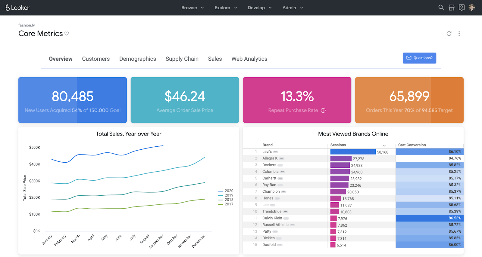
Source: Looker
Key storytelling strengths
- Connect easily to the Google stack with fast connectors to Google Analytics, Google Ads, BigQuery, and more.
- Make interactive reports and dashboards with filters, date pickers, and drilldowns.
- Build attractive, story-like dashboards quickly with templates and community visualizations.
Trade-offs
- It has limited advanced modeling and governance compared to full BI platforms.
- There's less native AI-driven narrative capability.
- It's better suited for departmental or marketing storytelling than full enterprise analytics.
Looker pricing
- Standard edition: Ideal for smaller teams (less than 50 users). Includes one production instance, 10 standard users, 2 developer users, and up to 1,000 query-based API calls per month.
- Enterprise edition: Built for larger or more security-sensitive use cases. Supports up to 100,000 query-based API calls per month.
Embed edition: Designed for analytics embedded into external apps or client portals. Supports up to 500,000 query-based API calls per month.
Note: Exact pricing is custom quoted and varies based on users, usage, and API calls.
Also read: Looker vs Zoho Analytics comparison
Best data storytelling tools: Side-by-side comparison
Here's a side-by-side comparison of the four best data storytelling tools from our list to help you make the right choice based on your specific requirements:
| Capability | Zoho Analytics | Power BI | Tableau | Looker Studio |
| AI assistant for Q&A | Ask Zia conversational analytics | Q&A natural language queries | Limited. Focus more on visuals and Data Stories | No dedicated NL Q&A |
| Automatic narrative generation | Zia Insights for contextual narratives | Smart Narratives in reports | Data Stories feature for written explanations | No native auto narratives |
| Story/slideshow presentation mode | Built-in portal and Advanced Slideshow with Zoho Show | Integration with PowerPoint | Story points to create linear narratives | Reports presented as pages. No formal story mode |
| Best fit | End-to-end storytelling for all types of users | Enterprises on Microsoft stack and IT-heavy environments | Data-mature orgs needing deep visual analysis | Marketing and web analytics reporting |
How to choose the right data storytelling tool for your team?
The right tool depends on where your data lives, who's building the reports, and what you need to do with the output. These five questions will help you narrow it down.
1. Where does your data live today?
Map your primary data sources before you evaluate any tool: spreadsheets, cloud apps, databases, or third-party platforms like Google Analytics, Salesforce, HubSpot, or QuickBooks.
The tool you pick should connect to those sources without a separate ETL layer or an engineering ticket every time you add a new one. Zoho Analytics connects to 500+ data sources, including files, databases, Zoho apps, and business applications like QuickBooks, Google Analytics, and Facebook Ads. If your source isn't on the list, there's a no-code custom connector builder that lets you build your own. Every manual data transfer is a point where something goes stale or breaks, so native connectors matter more than they sound.
2. Who will build and present the stories?
Think about who creates the reports and who reads them. If your team includes marketers, sales managers, or finance leads who don't work in SQL, the tool needs to stay out of their way.
Ask Zia in Zoho Analytics handles this directly. A user types a question in plain English, "What were my top five products by revenue last month?" and gets a chart back in seconds. For teams that also have data engineers or analysts in the mix, the platform supports custom SQL, data pipelines, and a semantic layer for more controlled analysis.
3. Do you need to embed stories into products or client portals?
If your dashboards need to live inside a customer-facing product, a client portal, or an internal app, you need proper embedding support: iframes or APIs, role-based access controls, and ideally white-labeling so the branding stays yours and there's no "powered by" badge showing up in your client's portal.
Zoho Analytics has a full embedded analytics and white-label BI offering. You can embed individual dashboards, specific reports, or an entire analytics workspace inside your own application, with a custom domain, your logo, SSO, and row-level permissions. If you're an ISV or agency building analytics into a product you sell to clients, this is worth a close look before you pick a platform.
4. How important is AI today and over the next two to three years?
AI changes who can actually use an analytics tool. Natural language querying removes the bottleneck of waiting for a report request to be fulfilled. Auto-generated narrative means the chart comes with an explanation already written. Anomaly detection catches problems before someone has to notice them manually and send an email.
Zoho Analytics' Zia AI capabilities cover the full range: Ask Zia for conversational querying, Zia Insights for auto-generated report narratives, predictive analytics, anomaly detection, and smart recommendations.
5. What is your timeline and implementation capacity?
Some tools are running within a few days. Others need an implementation partner and weeks of setup before anyone sees a useful report.
If speed matters, look for platforms with prebuilt report templates and clear documentation. Zoho Analytics ships with prebuilt dashboards for sales, marketing, helpdesk, and financial apps. There's something to work from on day one, before any custom configuration begins.
Start telling better data stories with Zoho Analytics
All four tools in this list can help you move beyond static reports, but Zoho Analytics stands out when you need:
- AI-powered narratives that explain what's going on in plain language
- Conversational analytics that lets anyone “ask the data” without knowing the schema
- Built-in slideshow and presentation capabilities that keep stories in sync with live data
- Strong embedding and governance to share stories securely at scale
If you want your dashboards to stop collecting dust and start driving decisions, Zoho Analytics is a very strong place to start.
You can explore Zoho Analytics with a free trial, including its data storytelling capabilities, Zia Insights, and slideshow features. Set up your trial, connect a few key data sources, and build your first live data story this week.
15-day free trial. No credit card required.
Frequently asked questions
1. What is the difference between data storytelling and data visualization?
Data visualization shows you the chart, while data storytelling explains what the chart means, why it matters, and what to do about it. Visualization is one component of storytelling.
2. Which data storytelling tool is best for non-technical users?
Zoho Analytics is best for non-technical users. The drag-and-drop report builder, Ask Zia's plain language queries, and Zia Insights' auto-generated narratives mean a business user can build a report and understand what it says without touching a formula or calling a data analyst.
3. Is there a free data storytelling tool?
Zoho Analytics has a free plan that supports two users, 10,000 rows, unlimited reports and dashboards, and basic AI analytics with no credit card required.
4. What are the three elements of data storytelling?
Data, narrative, and visuals. Data is the foundation. Visuals make patterns easy to see. Narrative gives context so the audience knows what to take away. If you remove any one, the story stops working.
5. Which tools are great for creating data storytelling presentations with charts and dashboards?
Zoho Analytics has an Advanced Slideshow feature built on Zoho Show where your charts stay connected to live data inside the presentation. Power BI lets you embed live reports directly into PowerPoint.
6. Are there any platforms that support data storytelling with AI-driven insights?
Yes. Zoho Analytics has Ask Zia for natural language queries and Zia Insights for auto-generated narratives on any report or dashboard. Power BI has Smart Narratives. Tableau generates written explanations through its Data Stories feature.
7. What platforms offer financial data storytelling tools for investors?
Zoho Analytics connects to QuickBooks, Xero, Stripe, and Zoho Finance through native connectors and generates financial dashboards with prebuilt reports. Power BI works well with Excel and Azure data sources commonly used in finance teams.
 Pradeep V
Pradeep is a product marketer at Zoho Analytics with a deep passion for data and analytics. With over eight years of experience, he has authored insightful content across diverse domains, including BI, data analytics, and more. His hands-on expertise in building dashboards for marketing, sales, and major sporting events like IPL and FIFA adds a data-driven perspective to his writing. He has also contributed guest blogs on LinkedIn, sharing his knowledge with a broader audience. Outside of work, he enjoys reading and exploring new ideas in the marketing world.